Friday, January 30, 2015

Cartographic Skills: Typography

Good day everyone,
        This post is in regard to this weeks Cartography assignment with lab exercise on Typography. Typography is the art or process of specifying, arranging, and designing type. This assignment included the below overall learning objectives:
  •  Demonstrate general typographic guidelines when making a map
  • Employ proper type placement for different feature types (point, line, area)
The lab to facilitate these objectives gave me a mapped area of Marathon Florida, sans labels. With this area I then had to employ the various tenants and practices associated with good typography to effectively label 17 different specific areas/items.

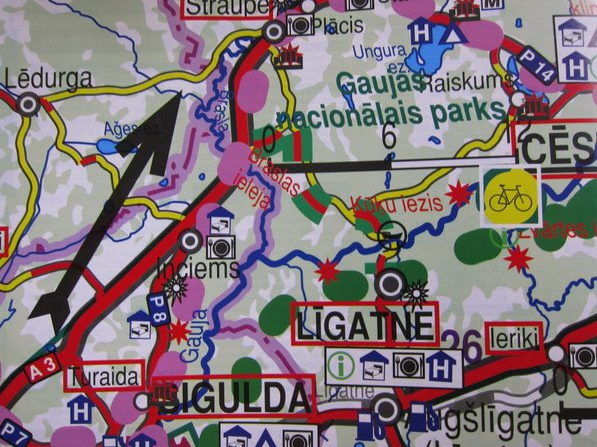
There are many different considerations to take into account when labeling items on a map. A rough outline of some of the key decision's is below:


    These come after you know you need a label, and have placed a label, and added the text to the label.

  1.    Determine Font 
    •   Serifed vs non serifed, does the text font match the other fonts being employed for its symbol type or mesh with your theme overall? 
    •   Color also goes with your theme and visual hierarchy. 
      •         Should it be less noticeable as base information, or stand out brightly as thematic information? 
  2.    Adjust Size 
    •   Reference your visual hierarchy for text size determination. 
    •   Larger fonts down to smaller fonts in rough order of Title, Legend, key symbology, base information,  name/date/source data etc. 
  3.    Adjust placement 
    •   This is heavily influenced by type of object being labeled. 
      • Point: get the label as close to the area without overlap as necessary following the Text book guidelines (Figure 11.24, pg 206 Thematic Cartography…) 
      •  Line: Refer to the above table, but try and keep the text above or parallel to the line, without going upside down. 
      •   Area: Can the text fit into the area feature, or need to go close by? 
      •  Add call out or leader line as necessary to avoid confusion. 
Here is my completed map of Marathon Florida with Marathon layout provided by UWF and edited by me exclusively in Corel Draw x7:


Since this lab was in reference to typography ill start there. I have employed one font, Cambria Normal throughout, with the exception of different water features labels being italicized. However with this font, varying sizes, outline colors, and positioning have been employed. Also, all of the Keys have utilized a leader line to subtly emphasize the area they belong to.
With this background, I wanted two things. First, a realistic water body for the island of Marathon to rest on, as well as a sense of the water and figure being up closer to you on the lower portion of the image, with the distance falling away as you continue higher along the map. This background picture, compliments of Google images, is from Destin Florida.
My map key: I also personalized the map key to be another element of florida by portraying a segment of grassy sand dune. The white sandy portion provided a good location for my symbology elements. Additionally, since the theme of this map is largely in part the Florida Keys, I utilized a drawing of a key (key being another suitable term in place of legend).
One last added touch: I had left a white border around the map to facilitate the feeling of having a horizon at the top of the picture to better facilitate figure ground with the water.
Thank you for your time. 

Monday, January 26, 2015

Cartographic Design

Greetings,
      This blog is in regard to this weeks Cartography assignment on Cartographic Design. Below are this weeks key Learning Objectives:
  •  Conceptualize and create maps according to need of end user
  •  Establish and implement visual hierarchy to emphasize important map features
  •  Apply contrast to map features to imply their relative importance
  •  Employ figure ground to make important map features appear closer to the end user
  •  Achieve map balance with the harmonious organization of map elements and empty space
  •  Symbolize layers by
The above learning principles were highlighted through this weeks laboratory assignment of creating a map of Washington DC's Ward 7 schools. The basic data for this map to include Washington DC Schools, Street/Highway's, Ward 7 boundaries, Park areas, etc were provided by the instructor/UWF.

My task was to take the data provided and create a map after having reviewed Gestalts Principles of perceptual organization. These are summarized with the key concepts from the text of: closure, common fate, continuity, figure-ground, proximity, similarity, smallness/area, and symmetry. Further these are enhanced by the aptly named cartographic design process which adds the following considerations: visual hierarchy, visual weight, contrast, figure-ground, and balance.

Here is my take on this weeks assignment created exclusively using Arc Map 10.2 desktop, composed of all mandatory layout elements with the addition of an inset map trying to work on the principles identified above.


Initially, I followed the hint from the assignments page and read through the lab instructions completely before beginning. I had just opened the Ward7Schools.mxd at the same time and was faced with more layers in Arc Map than I had yet seen applied to the table of contents. This was very daunting at first. The best thing that I did after completing my review of the instructions was to dedicate time to just orienting (I pointed myself east toward Asia, then realized being deployed, I’m actually in Asia (Cartography humor?)) myself to the items I had in front of me. This included turning off / on the various symbols, layers and changing their colors. Gaining this familiarization to the layers wasn’t an explicit written step, but most definitely one that I felt has to be implied to get over the initial daunted-ness. Applying the instructions seemed very much simpler thereafter.

For the execution of the map, the Gestalt Principle, and subsequent cartographic design principle which I wanted to focus on most is Figure-Ground relationship. This is established in a multitude of ways. For example, the school buildings are almost popping off the page, as they are an emphasized figure, and they lay on the ground which is ward seven. Further, Ward 7 becomes the figure by being lighter than the surrounding gray area which is now ward 7's ground. Other figure-ground relationships which mesh hand in hand with the principle of contrast can be seen with the font used. For example, the title is the largest font with other fonts being sized roughly in order that I want you to view them. This goes all the way down to the almost imperceptible name, date, and source data block. 
I could continue with my explanation of how I attempted to implement each cartographic design principle. But suffice it to say, I tried to follow the books example. I would be happy to add any further clarification or comment as necessary. Thank you for your time.


Brandon

Friday, January 23, 2015

Intro to GIS; GIS and Cartography

Good day GIS enthusiasts.
The following is in regard to my Intro to GIS class assignment GIS and Cartography. This lesson and subsequent lab builds further upon the foundation of Arc Map use while building three fundamentally different maps seen below while using sound cartographic principles.
Student Learning Outcomes include:
  • Create and alter the symbology of maps created in ArcGIS
  • Examine files from ArcCatalog and the ArcCatalog Window
  • Review raster pyramids Compare and contrast raster and vector data files
  • Identify and use all Table of Content (ToC) Views
  • Utilize dynamic text in a map layout
  • Create group layers
  • Review how to save a map as a map package
 The maps created through this lab build the above skills with data provided by the school using various aspects of our neighbor to the south, Mexico, as the focus area. With three individual maps that all build upon each other we will start with a look at Mexican population by state. Then see an overview of central Mexico highlighting major urban areas, federal roadways, major and primary rivers, and railways. And end off with a cartographic overview of Mexico. Once all the maps were processed they're respective layouts were tailored to include a title, neatline, legend, north arrow, scale bar, and name/date/source data. These elements are the minimum requirements for a sound map in this class.

The key skills and focus areas that were introduced in this lab were as follows: Creating your own shapefile from a more expansive layer of information. This is essentially taking a broad overview of data and tailoring it to the specific information you need to be effective. As such, I took an overview of states of multiple countries and selected and exported those from Mexico only into a new file. Additionally, extensive Layer review was explored showing different ways to navigate and use the data you add to Arc Map. And possibly most importantly to this lab, different methods of displaying the symbology provided by the various types of data. We will see this more below.

Map 1.


This map shows the states of Mexico utilizing a graduated color scheme of light tans (lower population) to dark browns (highest population) while not being overshadowed by surrounding elements.

Map 2.


This map shows you some of Mexico's largest urban areas and the sprawl of railways, roadways, and river ways that crisscross Mexico's landscape. It also gives you an inset map highlighting where in North/Central America your focus lies. One of the neat features I learned about and utilized in this map is that only cities with a population above 1 million people are labeled. You can also see I maintained a similar color and largely similar layout for the map elements as the previous map.

Map 3.


This map shows you the elevation throughout Mexico utilizing a raster Digital Elevation Model (DEM). It uses a stretched continuous flow color scheme. This starts with light greens as the lows, moving to yellows, tans, and ending with reds highlighting the peaks in the country. This layout also maintains an inset map highlighting Mexico and the focus area again. The other elements mostly maintain the previous maps standard layout with minor changes to the compass rose and name/date/data source elements due to spacing.

Thank you again for your time and interest.

v/r

Brandon

Monday, January 19, 2015

Owning My Map

Good day to you,
      Here we have a post dedicated to me owning my map. What this means is that I had an assignment about all the things that go into owning my map. A map isn't a map without several things to include a title, cartographers name, source information, scale, legend, neat-line or border, and north arrow. Now, yes there are map documents out there that are so well presented that some of these items might be omitted. However for the purpose of the class and assignment this was generated from all of the above are necessary. So adding these items to a map highlighting the location of the school I'm attending via internet (University of West Florida) was the task. However the real purpose of the lab was to continue to familiarize myself with the Arcmap program by having to add multiple dataframes, layers, and design elements to culminate into the below map while employing the basic elements common to most maps.
      If you happen to have read my previous post I can tell you that I apparently didnt learn my own lesson the first time. I once again reaffirmed to myself that when working with these wonderful programs, save early, save often. An hour or so into my creation I attempted to much processing at once causing the system to go unresponsive and have to be forcibly quit. On the plus side, I was able to get back to the point I was in less than half the time based on the first rounds experience.
    Ultimately as you can see I completed the below. To summarize, it shows the location of the UWF Campus in Escambia county while simultaneously highlighting Escambia county amongst all of Florida's 67 counties. Hopefully you find it simple yet elegant. Thank you.


Friday, January 16, 2015

Florida via Corel Draw

Hello loyal blog viewers and people who stumbled by randomly.
Today's post is dedicated to my Cartography class and this weeks assignment on enhancing a basic map exported from Arc GIS utilizing Corel Draw X7. The basic premise was to take an overview of Florida showing counties, major cities, the capital, and waterways and adding key map elements utilizing Corel Draw to change the basic map elements, then export as a usable JPeg. The map elements that were originally missing were the title, north arrow, neat-line, and map information to include data source, the creator (me) and the date created. Additionally it is up to the designer to import some additional imagery, to which i chose the state flag, state bird, state flower, nickname, and state seal. in the process of collecting all of these images and trying to figure out how to organize them I came up with both of the below images. I decided to utilize the same features with two layouts because of the grading rubric involved. I feel that I like the Landscape version better, however due to the overlapping of some items, and the state flag being the background I thought it might be downgraded a few points. Vice the standard portrait layout which has all the rubric required elements, it just doesn't strike me as aesthetically pleasing in either case, both were created by importing internet pictures with the wonderful Snipping Tool, and adjusted using Corel Draw. The tools I used most were the Picking tool, Text editer, and some color utilities.
So why would I spend so much time creating two maps instead of just one? Easy, its only the second week of class so I'm trying to feel out the grading rubric. Both clearly meet the rubric criteria, however the one with more design freedom being used might go a tad overboard, and with two maps I should most definitely have demonstrated all of this weeks necessary skills in manipulating Corel Draw.
So, I feel I should inform you of this most valuable lesson when dealing with Corel Draw, ArcMAP, remote Access Servers/Desktop... Save Early, Save Often. I was halfway through my first rendition of my map when all of a sudden I was kicked from the remote connection. Now I did notice before that I was doing my work during a standard maintenance time, but everything had been smooth up to that one instant. So all in all, I got to exercise all the skills I had just learned over again, while saving repeatedly.
So what do you think, which map is the better one in your opinion?


Thanks for stopping by.


v/r


Brandon

Monday, January 12, 2015

Cartographic Skills Map Critique


       Good whatever time it happens to be for you dear reader. Today's post is in regard to the my first weeks assignment in my Cartography skills class. The overview of the assignment is this: learn the basic principles behind what makes an effect map and apply them to some maps of your choosing. Let me break down the key components that I reviewed. Numerically there are 6 commandments to a map, and 20 Tufteisims (the guy who so aptly put words to successful design elements of map), and 5 key British Cartographic Society inputs. For a better look at these as outlined by my Cartographic professors products, please see below (after the Good/Bad comparison).
       So, being deployed while starting this class I find it only appropriate to include a map of where I happen to be staying. Usually, for those who have never been here, there is a lot of mystery behind this place and its people. And the general populace of this class may or may not know how diverse the makeup of this country really is. The below map is an excellent portrayal of the diversity of Afghanistan.


The above is an example of a well-designed map. I have come to this conclusion based on the following observations. First, even without a prominent title you still see the substantial information that the creator is intending to portray; Ethnolinguistic groups in Afghanistan. This is noticed as Afghanistan is prominently displayed with other details of surrounding countries fading away from the center. The color scheme highlights the complexity of how the varying groups are dispersed while not being overshadowed by the labeling scheme of the sub-data, such as the major cities in Afghanistan. The map has an efficient layout, accenting the countries natural contours, evidenced by the legend being effectively placed in the bottom right of the picture. Further “Chart Junk” is minimized to key components such as the distance scale, also aptly placed below the legend. Lastly the information is straight forward showing where majority groups are, there is little left to interpret about the data. There is no room to lie with this map, assuming the data used in its compilation was accurate.


The above is an example of a well-designed map. I have come to this conclusion based on the following observations. First, even without a prominent title you still see the substantial information that the creator is intending to portray; Ethnolinguistic groups in Afghanistan. This is noticed as Afghanistan is prominently displayed with other details of surrounding countries fading away from the center. The color scheme highlights the complexity of how the varying groups are dispersed while not being overshadowed by the labeling scheme of the sub-data, such as the major cities in Afghanistan. The map has an efficient layout, accenting the countries natural contours, evidenced by the legend being effectively placed in the bottom right of the picture. Further “Chart Junk” is minimized to key components such as the distance scale, also aptly placed below the legend. Lastly the information is straight forward showing where majority groups are, there is little left to interpret about the data. There is no room to lie with this map, assuming the data used in its compilation was accurate.


       Thank you for taking the time to go over 
       this with me, I appreciate it. And once
       again, per the first paragraph, if youre 
       curious about the rules of maps then 
       please see the document to the right.

       Thank you, come again.


       v/r


       Brandon

Sunday, January 11, 2015

Intro to ARC GIS Overview Lab

    Welcome to week one of my GIS Odyssey. The first lab of the introductory class is now behind me. It is a simple overview of ArcGIS by creating a World Map highlighting the countries of the world based on population. In this introductory lab which is wonderfully spelled out for the first time ArcGIS user such as myself I was able to become familiar with the basic tools of the program. Below is a summary of my process. What it doesn't show you is all the bad mouse clicks, drags, wrong double clicks, highlighting of the wrong window and many hours of OCD that goes into creating what looks like a simple map. It wasn't that difficult looking back at it. Time consuming sure, but most definitely neat and I cant wait to see more in depth applications of this tool.
Process Summary used in ArcMAP


1.       Open ArcMap and select blank map. Or reselect “recent map” when returning later.
2.       Unzip this weeks lab data on my S: Drive.
3.       Map the S: Drive. (This shouldn’t have to be repeated for subsequent labs.)
4.       Open this weeks lab data in ArcMAP from the S: Drive.
5.       Review the Cities and World Populations layers in accordance with the lab instructions.
6.       Learned lab terminology while answering map specific questions related to various tools.
7.       Go to “Properties” associated with your layers.
o   Use the Quantities feature to highlight the bulk of the data for this weeks lab.
o   Adjust numerical data, colors, and names as needed.
8.       Adjust map location on screen using the Pan tool
9.       Swap to layout view and add overlay data
o   Title, Legend, Created by/source/date, scale, and compass rose
10.   Export in accordance with introductory instructions
o   S: Drive, H: Drive, personal C: Drive
11.   Finish deliverables and submit to appropriate drop box. Don’t forget the blog. 


A note: Hopefully as I figure out more about this blogs layout I will be able to make them look more and more cool. Thank you.


Respectfully,
Brandon